3.2.2 Dashboards
- Login to your Datadog account and navigate to Dashboards. You should see a list of nearly 20 dashboards that have been auto-discovered. If you only see a few, navigate to Integrations, scroll down to the Kubernetes-related integrations and install them. Return to Dashboards and select the Kubernetes - Overview dashboard.
- At the top, you can see high level information about your cluster.
- Below that and to the right are lots of different graphs and charts about the different resources you have been working with.
- Click on the Running pods per node widget. Notice the pop up menu that appears.
 From here you can go straight to other related pages on Datadog. You can even copy the configuration for this widget and paste it into a new dashboard.
- Find a widget with some sort of anomaly or bump on it. Click it and choose Find correlated metrics. Datadog will open a view to show all other metrics that experienced a similar bump at a similar time.
- Since this is a built in dashboard, you cannot modify it. But click the Clone Dashboard button at the top and you can tweak it.
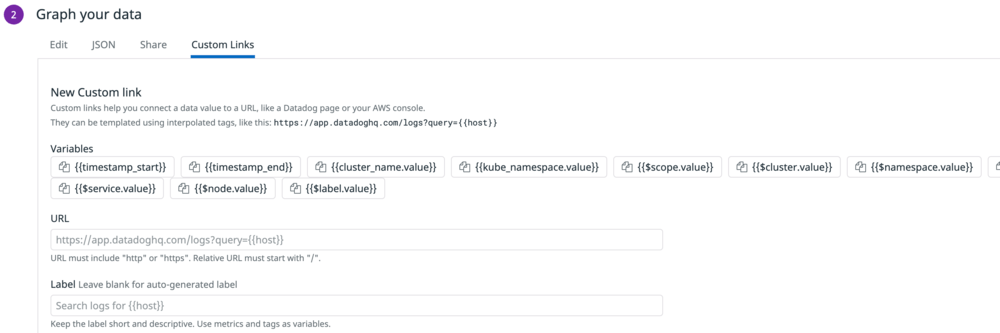
- On your new cloned dashboard, click on the Running pods per namespace widget. Notice there is a Custom Links section of the menu. Click Edit Widgets at the top of the dashboard.
- Click the pencil icon on Running pods per namespace. Here you can tweak everything about this widget, including adding custom links and those links can include information from the graph in the query string. So you could create a link that searches Github or Jira for issues that happened at that time, or add notes about it to some other application.